
The Sweet Life
I am ever so guilty for being an negligent blogger. If you are in the Architecture field and you work in an office for more than 10 hours a day, I’ll be amazed if you can afford to blog daily. Okay, so I’m rationalizing. I’m sure there are architecture-inclined people out there who make time to blog. The sad thing is, sometimes I don’t. To compensate, I will try to do more quality posts. Quality over quantity, yes? I hope this will be worth your while. 🙂
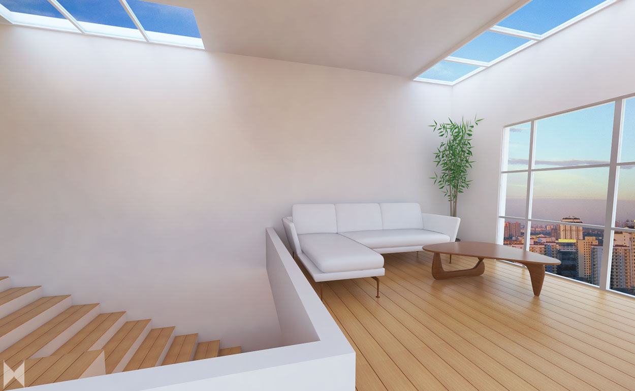
I was playing around with SketchUp and Vray render settings when I decided to do a trial design of another interior. My “playing around” was cut short when work started to pour in as I mentioned in a previous post. Now even I wonder if this interior is minimalist or just plain unfinished. See for yourself!
 Oh yes, I love wooden floors – in case you are now starting to wonder why I use the said material over and over. They just look so great in renders and in real life. Since I already have a nice floor, I just added big windows, threw in a few furniture and I’m done. Minimalist, I may say.
I promised a friend that I will finally put up a Vray rendering tutorial. This isn’t that post yet but maybe I can do a separate one showing the how-to of the following rendered images.  Since I have lots of windows I thought of just letting
 natural light Vray sun in instead of using artificial lighting (IES). To make the render more realistic, I used HDRI for illumination. A good tutorial on HDRI settings (if you cannot wait for the one I’ll be making) can be seen in this video.
See the view outside the window? That image was my chosen HDRI. However, I only wanted the the illumination and not so much the background so I saved it as PNG to edit it out in Photoshop later on. The output? Ta-da! Now as if my space is a penthouse in a high rise building! I can only imagine, right? When I wanted to showcase more of my Vray than my Photoshop skills, I try to limit the editing to a minimum. Aside from the change of background, I just synced the colors outside with the colors inside and that’s that.
 But here’s the best part: I get to add myself in the scene! HAHAHA. I need a good place to take my outfit shots and I know I can never go wrong in the 3D world. Okay, so my superimposition isn’t so flawless but I was hoping you’ll let that pass. 😛
 Minimalist or unfinished? Minimalist! I like the openness of the space, don’t you?
 When it comes to the outfit, well, I didn’t go so much with less is more.
  Confession: This one’s definitely unfinished. 😛
 Pattern on another pattern and two necklaces piled over the other, what do you say? Yay or nay? 🙂 I usually do Design- Inspired posts so this time I decided to do a contrasting yet complementing Fashion+Architecture.
Hope you liked my version of a Suite Sweet Life and hype this look on LOOKBOOK!


